|
The 1929 & 2007 Bear Market Race to The Bottom
Week 82 of 149
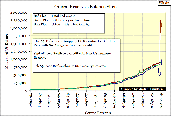
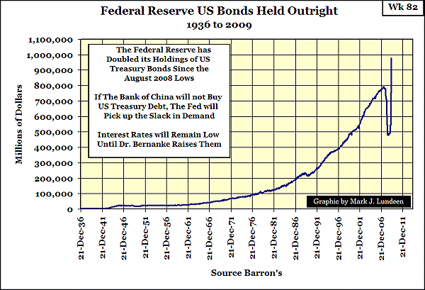
The Fed Doubles Its US Treasury
Holdings in only 9 Months!
Electrical Demand Down 3.01%
NYSE Ice Age Update
Examining the NYSE Breadth & DJIA
8 May 2009 Color Key to text below
Boiler Plate in Blue Grey
New Weekly Commentary in Black
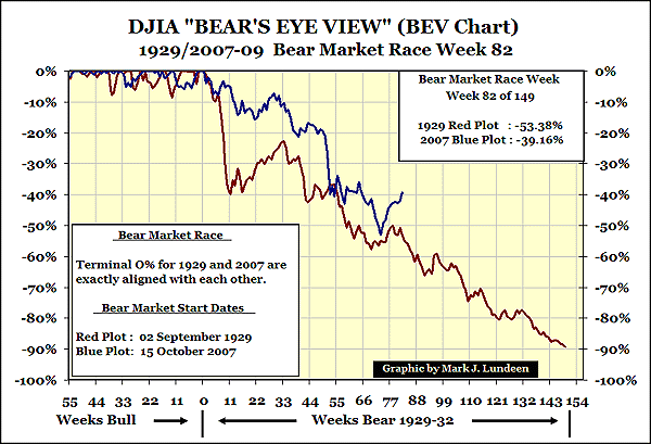
Here is the BEV chart for the Bear Race.
Wk82 of the 1929/32 Bear is where the DJIA slipped into the abyss. Wk82 for the 2007/09 Bear is when we saw the continuation of an excellent upward bounce! So, is it safe to assume the Bear Market is over? Well I've always said Bear Markets are sure to have good bullish corrections within them. This Bear has been a real miser when it comes to passing something out to the Bulls. It only allowed a tradable bounce after it became the #2 all-time deepest DJIA Bear Market. But it's a big bounce. Using weekly closing prices, the 1930's correction saw a +27.36% rally during a 17-week period. Our Bear's bounce is +29.39% in 10 weeks. Again, these percentages are the weekly closing price data used in the above chart.
There are good reasons for calling an end to the 2007/09 Bear Market in May of 2009. It was massive, the biggest Bear since 1932. The economy is suffering from high unemployment, and lots of other economic bad stuff. Corporate earnings are falling. I wrote an article on the DJIA and its Earnings in 2007. Real Bull Markets have no problems starting during periods of falling earnings as the charts in my past article clearly show.
But in the past, before the Bull Market started, the Bear was pretty much finished with cleaning up the mess left from the previous Bull Market's party. I'm very concerned about all the financial trash still around. Doctor Bernanke monetized over a trillion dollars of worthless sub-prime mortgages from Wall Street. This trash should have been written off and its holders placed in receivership. But instead we see this toxic waste sitting there on the Fed's balance sheet!
So there are good reasons for believing that the Bear has gone away. I admit that. But when I look at the above chart, I just can't believe that the Bear is going to allow the Bulls to partying again, in earnest, until he finishes his job cleaning up the 2000-2007 mortgage fiasco. It also seems that a new crisis in commercial real estate is coming upon us as Treasury yields are going up. President Obama and the Democratic- controlled Congress are still planning to sell a few trillion in new T-Debt into a soft bond market. Rising T-Debt yields are usually very hard on the stock market, but it seems not just yet.
So if the market is going up, get onboard the bandwagon! I'm only reminding the Bulls there are still massive unresolved economic, accounting and fiscal issues. I don't believe these problems are just going away, because the Federal Reserve and US Treasury Department want them to.
So I'm still a long term Bear, and I'm not anyone's investment advisor! Understand that what you have been, are now, and will be reading in the future (until further notice) is my personal economic research that I'm making available to the public only because I'm a nice guy.
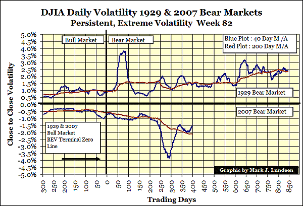
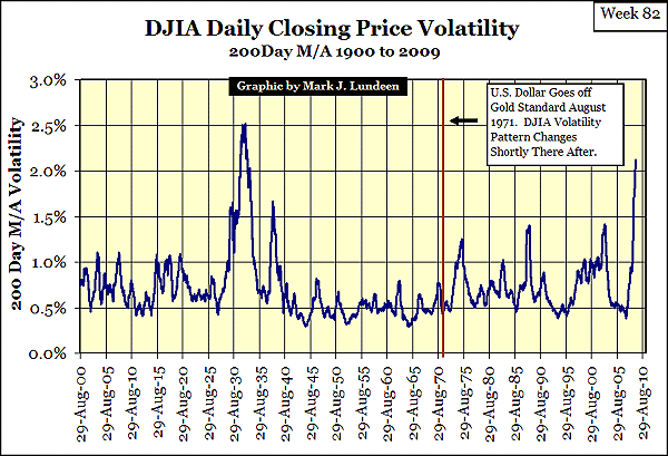
Below is my volatility chart comparing 2007's 40 & 200-day moving average closing price volatility with 1929 bear market volatility.
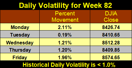
The 40 Day M/A is going back down, but the 200 Day M/A is going sideways. Friday 08 May saw a 70% A-D Day. What was unusual about this 70% day was that the daily volatility was only 1.96%. That is a lot of advancing shares for only a 1.96% gain in the DJIA. Even the S&P 500 was up only 2.41%. Typically such extremes in market breadth occur when daily volatility is 3% or more. Remember, 70% A-D Days historically happen only once a year and frequently there have been periods of years between them. We have been seeing a couple a month since March of 2007. That is very much like the 1930s.
Note: 2007 values are actually positive. They were inverted so 1929 would fit on top and 2007 on the bottom. So for 2007, please forget the negative valuations and focus on the percentages.
(Remember, with the 2007 data, up is down and down is up!)
1929/32, Wk 82 200 Day Moving Average Volatility: 1.52%
2007/09, Wk 82 200 Day Moving Average Volatility: 2.12%
Friday 08 May saw a +70.26% A-D Day
Historically, daily 1% swings from the previous day's closing price in the DJIA, while not uncommon, should not occur on an almost daily basis. The stock market is running a fever with its "Persistent, Extreme Volatility."
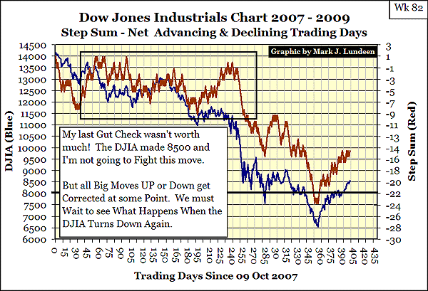
What can I say about this chart? The Step Sum and DJIA are running up the hill like a couple of fit athletics. How far can they go? Farther than I think possible, but not as far as most people would like is the answer that comes to my mind.
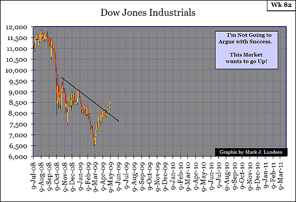
Here is another look at the DJIA. Eleven thousand on the DJIA is a long way up from 8500, even for a raging bull. There will be a correction somewhere between 8500 & 11,000.
Personally, I'm focusing on the fact that the Washington Wrecking Crews, who brought us the mortgage crisis and then gave the US auto industry to the United Auto Workers, are still calling the shots. I also think in the next few years the Bear will be consuming the credibility of the Washington politicians and regulators, as the valuations in the markets decline to a suitable level.
The Step Sum is an indicator of market sentiment. When the underlying sentiment is bullish, the Step Sum will rise. When bearish, it falls.
Think of the "Step Sum" as the sum total of all the up and down price "steps" in a data series over time; an Advance - Decline Line for a data series derived from the data series itself. Logically, bull markets will have more net up days, while bear markets will have more net down days. Understanding the Step Sum is no harder than that.
The Fed Doubles Its US Treasury
Holdings in only 9 Months!
The Bank of China is slowing down its purchases of US Treasury Debt. The Federal Reserve is speeding up its purchases of US Treasury Debt.
What you are seeing below will ultimately lead to the death of the US dollar.
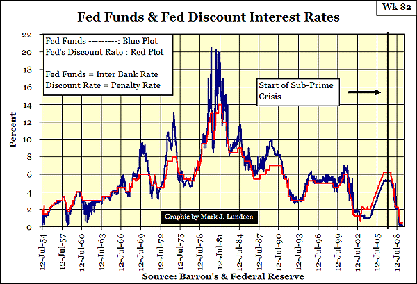
And then below, we see these two key monetary rates at levels that confound my ability to make an adequate comment. The Fed is pricing money to make commercial and retail loans possible. But the last time they lowered these rates below the point of prudence in 2002, they killed off a significant percentage of the banking system's customers, as well as some of the big banks! Low official interest rates are always a sign of great structural weakness. What would happen if Fed Funds were restored to 3.00%? A resumption of the mortgage crisis I suspect.
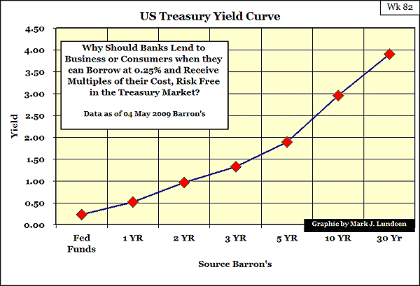
So when the banks borrow money from the Federal Reserve at the current 0.25%, who do they now loan it to? It seems to the US Treasury via the T-Bond market.
Currently, banks can borrow money from the Fed at 0.25% to purchase US Treasury Debt yielding multiples over the Fed Funds Rate. It's a safe investment, as Barney Frank can't haul a banker in front of a camera in the Congress for buying Treasury Debt.
The US Treasury is going to the bond market with massive new issues of debt to be sold. With the US Long Bond Yields at such low yields, it indicates that there is great demand for US Debt, even as foreign demand for US Debt is shrinking. What is the source of this demand? Massive monetization of US Treasury Debt by the US Banking System. Significant CPI inflation can't be far away.
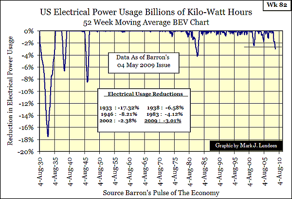
Electrical Demand Down 3.01%
There are many measurements of economic activity, but for the price of a copy of Barron's, the best by far is Electrical Power Consumption. It's nice that Barron's has been publishing this weekly data series since 1929, so we can compare the 52 Wk M/A on a BEV Chart for the past 70 years.
In Wk 58 I wrote a detailed analysis of electrical power consumption that you would find useful in understanding the chart below.
It's difficult to make a direct comparison between 1929 & 2009. This is because demand for electrical power in 1929 was mostly industrial. Residential electrical demand has grown greatly since 1929. I currently live in a house built in 1910. This house in 1929 only had a few light bulbs and a radio plugged into the electrical grid. Today I have two computers, many electrical appliances, more than just a few lights and a 2.5 Ton AC Unit plugged into the grid.
My point is that in 1929, residential demand was puny compared to industrial electrical usage. If today we were to see this plot fall down to the -17% line, (God Forbid!) it would not just be due to a fall in industrial demand. It might also be from banks turning off appliances and lighting for square miles of formerly inhabited 10-story high condos.
So the fall in electrical demand from 1929 to 2009 is not directly comparable. But so what? A decline in electrical demand provides us with hard numbers on the progress of the current credit debacle. So I'm tracking this data and will show this chart again when it hits either 4%, or reverses and rises above 2%.
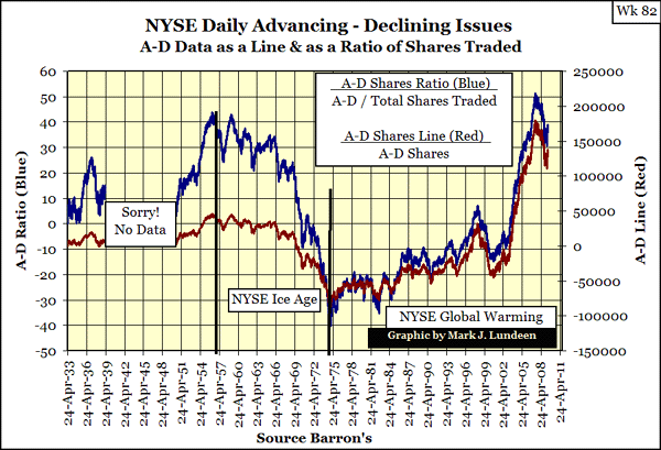
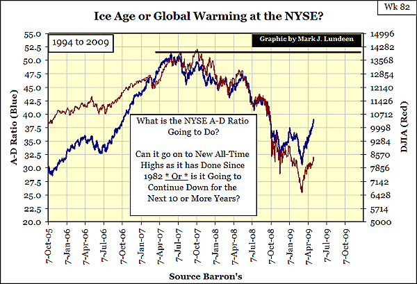
NYSE Ice Age Update
In Wk 70, I touched upon NYSE Daily Breadth with a quick look at 60 years of daily Advancing - Declining shares traded on the NYSE. The key item from my Wk 70 comments is long periods of rising and falling A-D trends exist. These trends in market breadth are important supports for bull and bear market cycles in the stock market. After 12 weeks, I thought this topic important enough to review the data and expand the analysis. I found something very surprising! But first, the review.
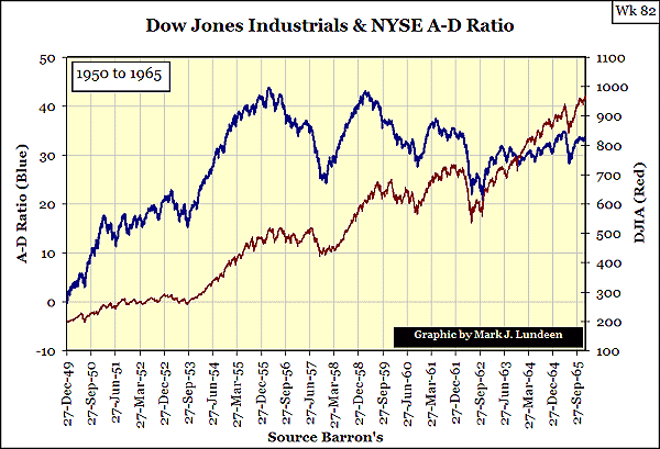
The chart below is from Wk 70. It plots both the A-D Line (Red) and the A-D Ratio (Blue). The A-D Ratio provides a more accurate picture for viewing decades of breadth data. We see long cycles in the chart below, lasting decades, where breadth trends are falling or rising.
I called the periods of declining breadth, "Ice Ages", as hot markets during an Ice Age ultimately cool down. Ice Ages are markets where bulls must trade in and out of stocks to make, and keep a profit. Periods of "Global Warming" are up cycles in NYSE breadth. Here is where we see extended hot markets in stock indexes, and where "buying for the long term" has a reasonable chance of proving profitable.
Too bad I have a hole in my data for the 1940s. A reader of my Bear Market Reports (Chris Mc***) sent me A-D data, but not the unchanged numbers. So I can't calculate the total numbers of shares that were traded to compute the A-D Ratio data points from 1939 to 1949. Therefore, in Wk82 I'm only going to use A-D Ratio data from 1950 to 2009. In the weeks to come, I'll spend time working Chris's numbers into the data for my next update on market breadth.
Using the data I have, it seems that both the Ice Ages and Global Warming periods are mirror images of each other.
Looking at the A-D Ratio (Blue Plot), note how the last Ice Age (1956-75) started with a strong upswing from 1950, and then broke down hard in 1957. From 1957 to 1969 (12 years) the NYSE A-D Ratio saw a disciplined retreat from its 1956 highs. From 1969 to 1975 the NYSE breadth then entered into a 6-year period of catastrophic collapse down to its bottom in 1974. It's worth noting that the 1956 to 1974 NYSE Ice Age climaxed with the first DJIA -40% Bear Market since 1942.
The 1974 to 2007 NYSE Global Warming cycle copied this same pattern, but in reverse of the previous NYSE Ice Age. The 1974 to 2007 Global Warming period started slow and then ended with a climax coincidental with the October 2007 DJIA's all-time high.
I've read materials on breadth indicators extensively. Typically, A-D Data is used as a trading tool. But I've never seen anyone take a long-term-look at decades of daily NYSE A-D Data. The reason may be that no one previously made the effort to compile the data before. But that would be hard to believe. Still, there is a good chance we are looking at something new in the chart above.
Examining the NYSE Breadth & DJIA
For a more detailed examination, I took the data from 1950 to 2009 and broke it up into my next 3 charts. As always, when you are looking at these charts, remember investors commit their money to the market, not the market's indicators. It's impossible to be right when you are following a market indicator but losing money in the market!
Moving on to the Chart for 1950 to 1965, the NYSE A-D Ratio peaked in 1956. Note that the DJIA continued to gain an additional 92% in its bull market for another 10 years. Understand that the NYSE market breadth is only looking at advancing and declining shares, not share prices. Shares going up (or down) a dime or up a dollar, is all the same with the A-D Ratio. Remember, studying the market is not studying science!
Examining the plots below, we see how strong moves up or down in the A-D Ratio still provide useful information. When the market is losing momentum or gaining strength, the A-D Ratio's trend changes usually confirms the market's price action. The A-D Ratio does help an investor decide if they should get in, out of, or hold on to a position.
The big difference between the 1950 - 56's & the 1975 - 2007's Global Warming cycles is their daily volatility. The 1950 - 56 cycle occurred during the quietist period of market volatility in the 20th century. This is not the case for the 1975 - 2007 Global Warming cycle. Periods of high volatility are times when the market's direction can change rapidly.
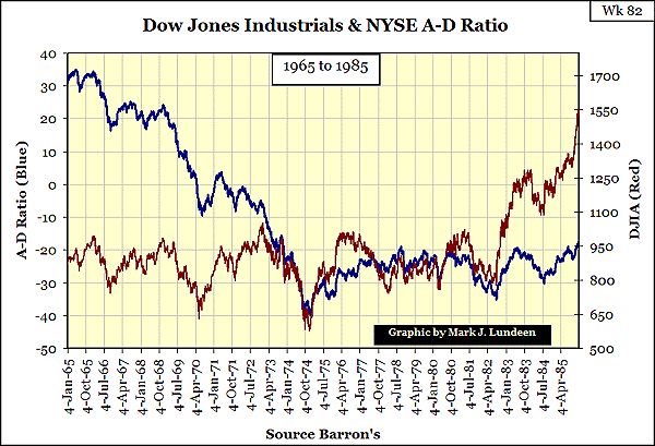
Looking below, the A-D Ratio from 1965 to 1974 seemed to be predicting the Great Depression Bear Market, but that didn't happen. However, from 1965 to 1982, the DJIA was range-bound between 700 and 1000. The falling, and then flat A-D Ratio was a good indicator to investors not to expect a raging bull market to start.
After August 1982, the DJIA took off in defiance of the A-D Ratio. Or did it? If you look closely, you'll note that the DJIA and the A-D Ratio are in sync with each other and only their comparative magnitudes differ. Still, it's fair to say that the A-D Ratio failed to produce a suitable signal for the start of the biggest DJIA Bull market in history.
The 1965 to 1985 chart above displays the possible relationships the DJIA can have with market breadth. We see periods when big changes in the A-D Ratio produce small changes in the DJIA. Then there are periods when big changes in the DJIA resulted from small changes in the A-D Ratio, and even periods when their relationships are very tight. Remember, this is not science, but there are rules in the market. One of these rules is that the rules change without notice.
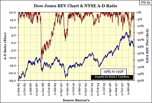
Inflation distorts price charts that span decades. Look at the Red Plot below. The drop in 1987 was 36%, but it appears smaller than the 18% drop we see in 1998. I note this effect because scaling difficulties, caused by CinC inflation of asset values, makes the A-D Ratio Plot look oversized relative to the DJIA from 1985 to 1995.
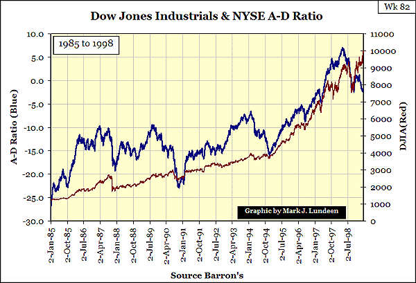
To better appreciate the A-D Ratio's relationship to the DJIA during the corrections from 1985 to 1998, I've constructed the chart below from the same data, but one that presents the DJIA in a BEV (Bear's Eye View) format.
As usual, a BEV Plot offers a wealth of information on the market's corrections not seen with price data when plotted as is. If this article is your first exposure to BEV Charting, please read my article on the DJIA -40% Bear Markets linked below.
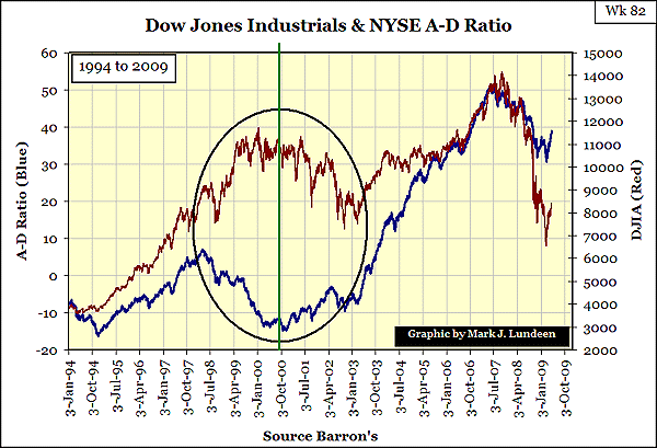
In my last chart on the A-D Ratio, I found something very unusual. What happened within the goose egg?
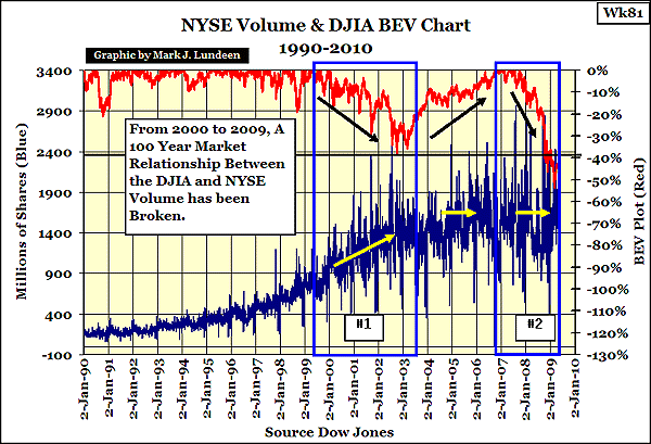
I suspect the market wanted to go down, but the "policy makers" wanted it to go up. The "policy makers" won that battle in the continuing war of which way the DJIA should go. This chart goes hand in hand with my NYSE Volume chart from Wk 81.
I'm not claiming that I've discovered two smoking guns for a secret government manipulation in the stock market. The Greenspan / Bernanke Fed era is on the record for using inflation for manipulating market prices.
"Like gold, U.S. dollars have value only to the extent that they are strictly limited in supply. But the U.S. government has a technology, called a printing press (or, today, its electronic equivalent), that allows it to produce as many U.S. dollars as it wishes at essentially no cost. By increasing the number of U.S. dollars in circulation, or even by credibly threatening to do so, the U.S. government can also reduce the value of a dollar in terms of goods and services. We conclude that, under a paper-money system, a determined government can always generate higher spending and hence positive inflation. Of course, the U.S. government is not going to print money and distribute it willy-nilly厖.." - Ben S. Bernanke, Federal Reserve Board Governor, November 21, 2002.
Note that Dr. Bernanke gave this speech during the stock market crisis of 2002. This was the era of the "Greenspan Puts" where the market expected the Fed to bail out investors during market drops. But when I think of it, they still do! In 2002, some market commentators on the internet suspected that this speech signaled Dr. Bernanke would be Greenspan's successor to the Fed Chairmanship. Good Call!
Answering the question posed in the chart above, I think the NYSE is now in a new Ice Age. After all, we've had 25 years of Global Warming in the NYSE, 1982 / 2007. The financial markets got so hot in the last Global Warming cycle that a significant percentage of the world's financial system's assets went up in smoke!
Any rational adult would know that what we need now is ice, and lots of it, for a good long time. This would allow intelligent life to once again evolve in Wall Street, Washington and Academia and enable the US dollar to re-establish an economic link to the actual production of American goods and services.
And for Pete's sake, will someone please take that liquidity syringe away from Dr. Bernanke!
|


 发表于 2009-5-12 17:22:58
 提升卡
提升卡 置顶卡
置顶卡 变色卡
变色卡